YouTube thumbnail fonts: the 12 that get clicks in 2026
The short answer: a very heavy sans-serif, in caps, 3 to 5 words, with strong contrast. Anton, Bebas Neue or Archivo Black if you want something free that works. But the font only does half the job: your text is sometimes displayed at 120 pixels wide, and that’s where it’s won or lost. Here’s what YouTube says, what readability research says, and what we’ve learned from 5,000 thumbnails delivered.
What YouTube officially recommends (and nobody reads)
“90% of the best-performing videos have custom thumbnails.” That’s YouTube saying it in its own documentation. Right after comes the platform’s only official typography guideline: “If you add text, make sure you choose a font that’s easy to read.” No recommended font, no required style. Just one criterion: readability comes before everything else.
On specs, most guides out there are stuck in 2020. The current official recommendation: upload at 3,840 x 2,160 pixels, 16:9 ratio, minimum width of 640 pixels, in JPG or PNG, up to 50 MB from a computer (2 MB from mobile). We cover all of it in our guide to YouTube thumbnail size.
Your text is sometimes displayed at 120 pixels wide
You design your thumbnail big on your screen. YouTube serves it in several sizes, and the versions it delivers range from 120 x 90 to 1,280 x 720 pixels. In a mobile feed, your big headline is about 2 centimeters wide. That’s the size where your font has to win, not full screen in Photoshop.
And the gap stretches the other way too: in early 2025, YouTube announced that TV had become the number one screen for watching YouTube in the US, with over a billion hours watched every day. So your type has to survive both extremes: tiny on a phone, huge on a TV. A font that only works at one size will drag your click-through rate down, and we saw in what counts as a good CTR on YouTube how much every tenth of a point matters.
The 12 fonts that work in 2026
These are the ones we see most in thumbnails that perform, with their license and the type of channel where they work best.
| Font | License | Best for |
|---|---|---|
| Bebas Neue | Free (Google Fonts) | Every niche, the safe condensed pick |
| Anton | Free (Google Fonts) | Entertainment, general-interest channels |
| Archivo Black | Free (Google Fonts) | Business, talk, a modern alternative to Impact |
| Montserrat ExtraBold | Free (Google Fonts) | Business, education, premium lifestyle |
| Luckiest Guy | Free (Google Fonts) | Fun gaming, family content |
| Bangers | Free (Google Fonts) | Comic-book style entertainment |
| Sora | Free (Google Fonts) | Tech, AI, modern business |
| Space Grotesk | Free (Google Fonts) | Tech, crypto, science |
| Impact | Free (pre-installed) | Old-school gaming, memes |
| Druk | Paid (from $50 per style) | Premium docs, sports, editorial |
| Obviously | Paid ($599 for the family) | Channels with a strong art direction |
| Futura Bold | Paid (Monotype) | Premium lifestyle, fashion |
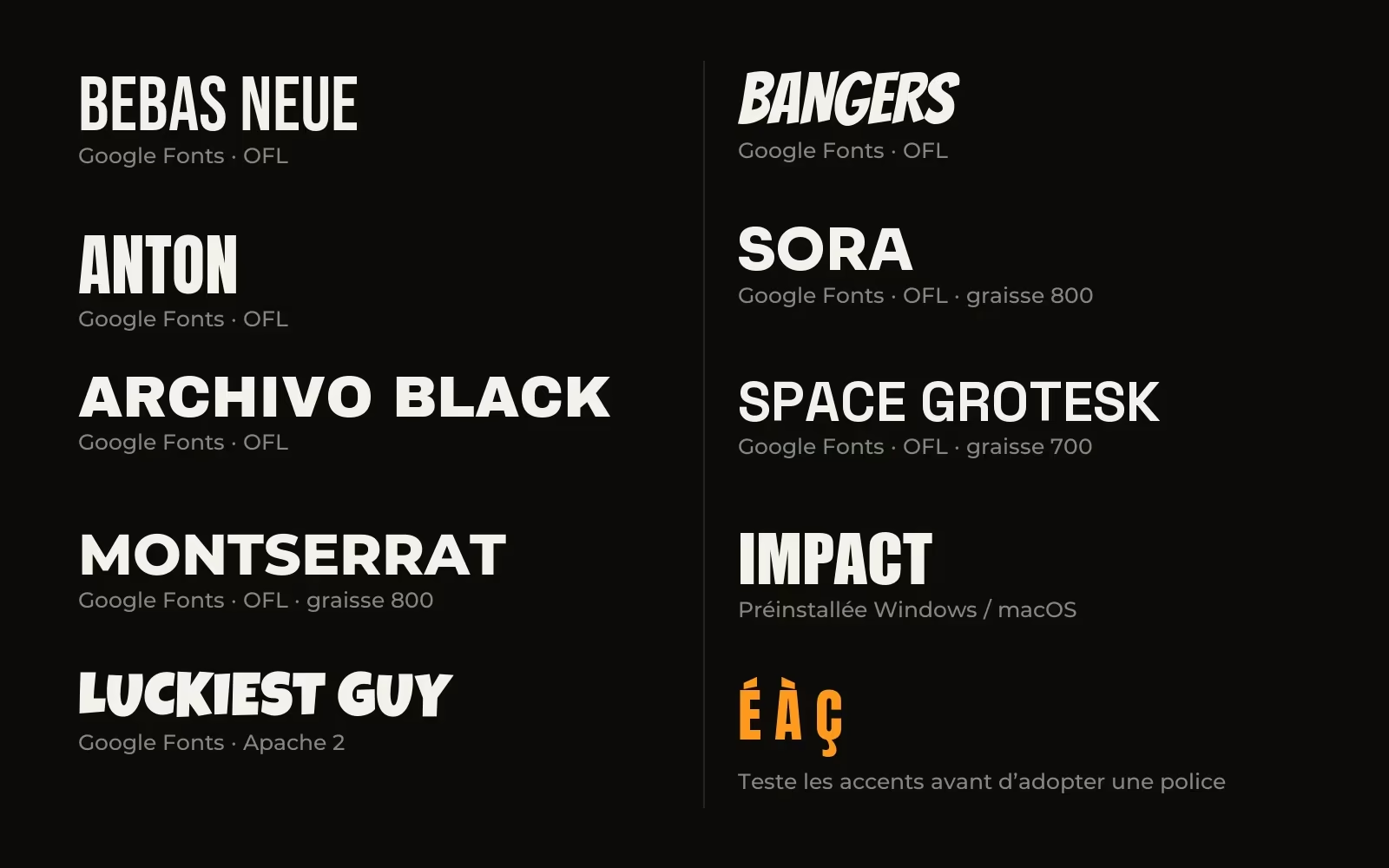
Nine are free: the first eight can be downloaded from Google Fonts, under the SIL OFL or Apache 2 license, so commercial use is allowed and there’s nothing to worry about on a monetized channel. Impact is the odd one out: designed in 1965 by Geoffrey Lee, it comes pre-installed on Windows and macOS. It still works, but it carries 20 years of memes with it.
And the question we get all the time: according to typography sites, MrBeast uses Obelix Pro for his thumbnails. Never confirmed by the channel, and more importantly, Obelix Pro is free for personal use only. Using it on a monetized channel breaks the license. That’s the classic trap with fonts from free download sites like Dafont.
What research says about reading at a glance
A thumbnail gets read like a highway sign: in a single glance. Conveniently, that’s exactly what the MIT AgeLab studied with type foundry Monotype, on in-car displays. The result of their simulator studies: a humanist typeface with open shapes (Frutiger) was read correctly with exposure times 8.8% shorter than a square geometric typeface (Eurostile). In a YouTube feed where everything is decided in a fraction of a second, a gap like that is not a detail.
Two more findings worth remembering from this work: lowercase letters and condensed widths hurt reading at small sizes, and dark text on a light background reads better than light text on a dark background at equal luminance. If you write in white on a dark image, your outline or drop shadow isn’t decoration, it makes up for a real readability handicap.
On contrast, the WCAG standard sets the minimum at 4.5:1 for normal text and 3:1 for large text. Interesting detail: text counts as “large” from 14 points if it’s bold, versus 18 points otherwise. Bold literally buys you readability. And since shrinking your thumbnail to 120 pixels turns your big headline into small text, aim for 4.5:1, not 3:1.
The mistakes we see all the time
- Thin or handwritten fonts. Elegant when big, invisible when small. Scripts and light weights are the first casualties of shrinking.
- Condensed lowercase. A double penalty measured by the research: small sizes plus tight shapes. Wide capitals hold up better.
- Too many words. Past 5, your text repeats the title instead of adding to it, and nobody reads it anymore.
- White text dropped straight onto the image. No outline, no shadow, no color block behind it: as soon as part of the image is light, the text disappears.
- Ignoring the license. A “free for personal use” font on a monetized channel is a cease-and-desist letter waiting to happen.
- Forgetting about accents. Some display fonts don’t have proper É, È or À in caps. The moment your text includes a name or a word with an accent, it shows. Test “É” before adopting a font, not after.
How we choose at Miniads
Across the 5,000 thumbnails we’ve delivered to more than 300 channels, we don’t have a default font. The niche decides: a business channel doesn’t use the same type as a gaming channel, and the font has to match the codes your audience already recognizes. We broke down real cases in 7 thumbnail examples that get clicks.
That said, whether you make it in Photoshop or in Canva, the final test never changes: the thumbnail gets shrunk to the size of a thumb, the size it’ll have in a mobile feed. If the text doesn’t survive, we rework the treatment: a weight heavier than bold, slight letter-spacing, an outline or a block behind the text, accents checked. The full method is in how to make a thumbnail that gets clicks, and you can test your thumbnails with YouTube’s built-in tool before you decide.
Frequently asked questions
What’s the most popular font for YouTube thumbnails?
The most cited are Bebas Neue, Anton and Impact, all free. Bebas Neue comes up most often because it’s condensed and designed for capitals: it stays readable at small sizes while leaving room for the image.
What font does MrBeast use on his thumbnails?
According to typography sites, his thumbnails use Obelix Pro, a font the channel has never officially confirmed. Careful: Obelix Pro is free for personal use only. On a monetized channel, you need a commercial license.
Is a free font good enough for YouTube thumbnails?
Yes. Google Fonts are licensed under SIL OFL or Apache 2, which allow commercial use. Anton, Archivo Black or Montserrat ExtraBold cover the vast majority of needs. A paid font like Druk or Obviously is mostly about standing out in a crowded niche.
How many words should you put on a YouTube thumbnail?
3 to 5 words, max. Beyond that, the text becomes unreadable at its real display size and repeats the title instead of adding to it. Thumbnail and title together should make sense in one second.